
Oh, Yeah?! Says Who?!
May 7, 2020
Since the stay-at-home order, I find myself to be increasingly on the receiving end of information. But unlike the students implied in this blog’s mission, I am an eager recipient. I’ve been seated in front of my TV for hours on end. While I’m creating lessons for my online college and high school classes I wade through various news outlets to glean the day’s information. I’ve always been a news junkie, and now that I have time, I watch five different news channels, listen to three different news-related radio stations, read countless news, business, and academic websites, and then I do my own fact-checking. I’ve found there are very few talking heads (in the media and politics) who present balanced information these days. I listen to the right, the left, the middle, and the independents, and then I make up my own mind.
One thing that’s been reinforced during this time is something my father used to tell me: Opinions are like assholes, everybody has one. Now, I recognize everyone’s right to have and voice their opinion. But if you’re trying to persuade me or sell me something, please make sure you have evidence to support your opinion. I’m going to need some sort of proof. I’m not a mushroom. You can’t expect to keep me in the dark and feed me shit.
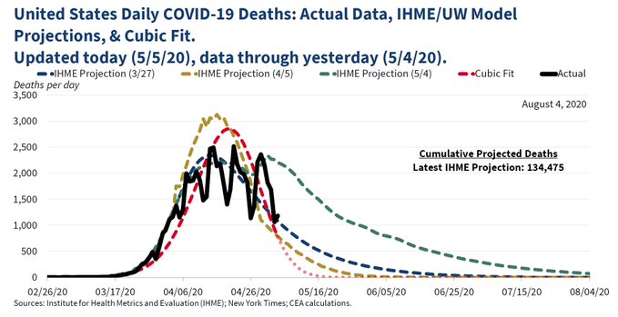
Take the graph above, for example. This is someone’s way to try and sell me on the theory that by May 15 – less than two weeks from its release – the deadliest worldwide pandemic in about 100 years will vanish. Really? Well, if that’s true I guess all the protestors and the more than 33 million unemployed Americans, and the projected 134,000+ people who were projected to die can sit back and ride it out for another two weeks until we’re back to normal. I mean, what else could the purpose of this graph be other than to belie other health sciences experts around the world who, citing years of scientific studies and experience, believe novel (meaning new) COVID-19 (“19” being the year it appeared, not the 19th such virus) will be with us for a very long time.
This is great! I need to get back to the gym. Let’s take a look at that graph!
OK. It’s from the United States administration so it has some authority, but it was created and presented by the White House Council of Economic Advisers (CEA). Wait… what?! That’s a red flag. “Economic Advisors” advising about pandemic mortality rates trending to “0”? What the hell do economic advisors know about the six basic steps in the replicative life cycle of viruses?
And… is that a jagged Sharpie line scribbled on the chart and labelled “actual”? Is the administration really pushing another Sharpie-enhanced graphic to prove their point and have all of us shaking our heads affirmingly? Might be another red flag, but I need to know more.
Can’t deny that those downward-trending dotted lines look good. I’m assuming this aspirational projection is based on relevant medical data sourced from reliable medical experts. The chart lists data from The University of Washington’s Institute for Health Metrics and Evaluation (IHME). That’s one of the administration’s go-to sources regarding COVID-19, let’s see what their site says.
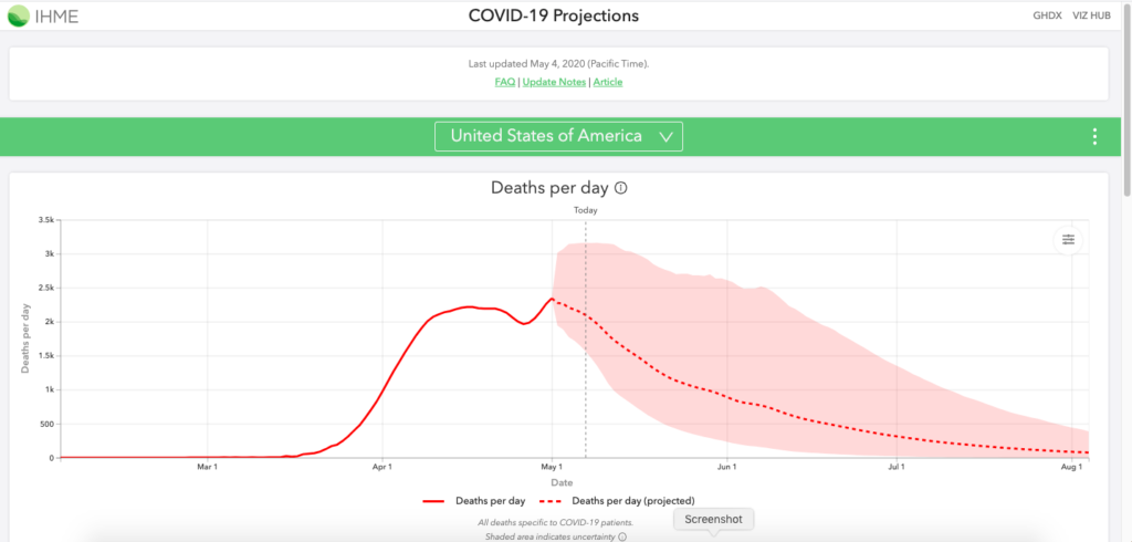
Hmm… another red flag. Had the CEA actually looked at the IHME model, which was updated on May 4, 2020, the day before the chart was released, they would have seen the projected daily (that’s DAILY) death count for May 15 is 1,500 Americans with more than 135,000 dead by August 1.
OK. That’s enough red flags. The chart is shit. So, who’s behind this CEA fiasco?
According to the CEA’s Twitter Account, the chart was intended to “better visualize observed data, we also continually update a curve-fitting exercise to summarize COVID-19’s observed trajectory. Particularly with irregular data, curve fitting can improve data visualization. As shown, IHME’s mortality curves have matched the data fairly well.”
Here’s the IHME chart for comparison (or see it here). Not sure who at CEA thought their May 15 “0” total “matched” the IHME’s “1500” total for the same day.
The author of the chart, according to the New York Times, was Kevin Hassett, who called criticism of the chart “silly.” Quoted at length in an unchallenged article the day after its release, the New York Times reported that Hassett said the chart “was not a forecast of deaths and never meant to be read as one,” and it “was not even a model of the virus.” The NY Times said, “The chart was intended to show a simple mathematical formula, logged in a popular spreadsheet program, that produces a graph that roughly aligns with the forecast model of daily virus deaths produced by a team at the Institute for Health Metrics and Evaluation at the University of Washington. It looks like a smooth curve, peaking near the end of April and falling off quickly this month. The point of the curve, Mr. Hassett said, is to show how the actual death count in the country has matched up with what the institute’s model had forecast in the past.”
In the “past”? Really? How far back did he go? As stated earlier, data from the site was updated on May 4 and the death count was 1,500 beyond “0.”
Now, here’s the kicker. The NYT said Hassett told them, “he had never shown the curve to the president or any members of the White House coronavirus task force, and that the White House chief of staff, Mark Meadows, has confirmed to him that no one in the administration has ever used the chart as a forecasting tool.”
Perfect! Here’s a guy, an economic advisor gone rogue, posting a mathematical – not scientific – pandemic representation created using a spreadsheet formula to present an unrealistic – and unproven – scenario under the guise of White House approval. Hassett and the CEA just flew it up the flag pole, got a few people to salute, and now that bogus spin lives forever in cyberspace. There will be people who will take it on face value, and never bother to find out (nor do they care) that the entire thing is unsubstantiated or that no one – other than the economist – believes it’s a viable theory.
Probably more disturbing is that no one from the White House has come forward to say this is totally inappropriate.
I tried to find more sources about the graph on FoxNews.com, but a search of Kevin Hassett at 8:30pm on Wednesday night, May 6, 2020, returned “0” results about the chart. Same for CNN and the three network news sites.
I did find references on several business news sites (afterall, an economist did make the chart), and one, Business Insider, didn’t turn a blind eye. They ran two stories – one titled “Trump’s advisers released a ‘beyond stupid’ mathematical model of coronavirus deaths created in Excel by a controversial economist,” and the other titled, “White House economic adviser Kevin Hassett created a baffling ‘cubic model’ showing coronavirus deaths would hit 0 by May 15. It turns out he used a basic Excel function for his controversial projection.”
That touched off a Twitter storm of he said/she said back-and-forth among a handful of reknown economists on both sides of the aisle.
I don’t trust politicians or anyone in the media who say “sources tell me,” but then don’t name the sources. Who are they? Like Ben Bradlee during Watergate I want names that I can look up, and determine for myself whether the talking heads are telling me the truth. And this isn’t just for me. I want the opposing side to be able to vet the sources and either corroborate or discredit the information. If you swear, up and down, that you have irrefutable evidence, I want to see that evidence.
Unfortunately, no one cares today in our polarized world about being “right.” They say what they want, let it fill a news cycle for a day, and then say something else. And when they’re confronted about past statements, they either deny saying them (despite audio/video evidence to the contrary) or they say they were misunderstood or taken out of context.
I’m skeptical of everything I see, read or hear. No matter the subject, I’m going to fact check and find the most credible authorities (yes, more than one) and listen to what they have to say. Credible, to me, is someone with extensive experience in a chosen field, has been right more than they’ve been wrong (no one has a perfect career), and is recognized and respected by their peers.
I have yet to find a national politician that is a credible authority on anything other than keeping their own job. Like talking heads in the media who push their one-sided views with no validation, they’re all just assholes with an opinion until they prove otherwise.


